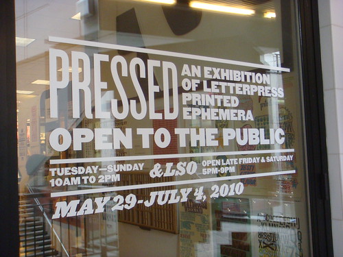
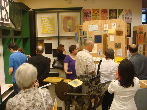
Denver, Colorado, has been a hotbed of activity related to typography and letterpress printing this month, with a series of type-centric events and exhibits. Designer and printer Rick Griffith of Matter has worked with the Design Council at the Denver Art Museum, AIGA Colorado, and Mohawk Paper, to organize Pressed, an exhibition of letterpress printed ephemera.
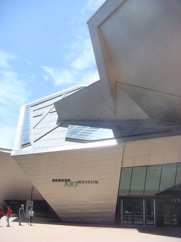
The Denver Art Museum's Frederic C. Hamilton building
To kick off the show, the Denver Art Museum hosted two events, including a night of printing demonstrations and a “letterpress typography symposium” with screenings of Jack Stauffacher, Printer about the San Francisco publisher Jack Stauffacher; and the recent Typeface documentary about the Hamilton Wood Type Museum.
I was honored to speak after the screenings on a panel with Jim Sherraden & Brad Vetter from the much-loved Hatch Show Print, Denver’s resident letterpress guru, Tom Parson, and Rick Griffith as moderator. As you might imagine, the discussion covered a variety of typographic topics, but seemed to have an emphasis on the history and culture of letterpress as it relates to contemporary typeface design, design education, and poster printing.
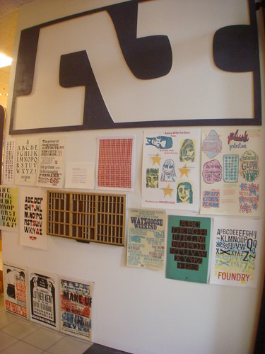
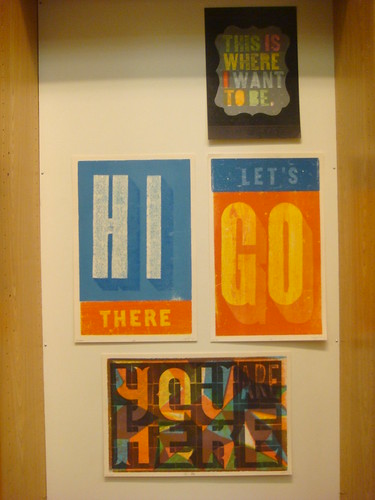
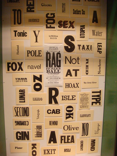
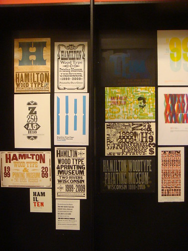
The highlight of the weekend was the opening of the Pressed exhibit and store in the Denver Pavillions. Rick and his team have collected a huge amount of contemporary letterpress work from all over the US and beyond, and presented it in an impressive gallery with giant 8-foot-tall wooden letters. Just about every inch of wall space is covered with colorful prints from Hatch Show Print, Amos Paul Kennedy Jr, the Hamilton 10th Anniversary Show, Yee-Haw Industries, and many, many, more artists/designers/printers.
The show will remain up in Denver through July 4th, after which it will continue on as a traveling show. A catalog is also being produced for the show. For more information and updates check DesignArtArtDesign, the Pressed project page on Kickstarter, and Matter on Twitter.


The treasure trove of vintage photography featured on Shorpy provides endless samples of commercial sign painting and architectural lettering from the 1850s through the 1950s. Though the site doesn’t specifically focus on the topic of graphic art, the abundance of lettering isn’t surprising considering the amount of images from the so-called Second Industrial Revolution – a period of dramatic growth in consumer culture, fueled in part by public advertising.
The high resolution of the images (most of which were extracted and adjusted from reference images in the Library of Congress research archive) makes thorough inspection a rewarding task. A surprising number of photographs that appear barren of lettering in their low-resolution form often reveal impressive examples when viewed at full size. In some instances you can even make out the signature of the lettering artist.
Many images on Shorpy show not only interesting lettering, but a high concentration of it. Any one scene may contain dozens of notable examples, stacked and layered as far as the eye (or camera) can see. This illustrates the volume as well as variety of lettering that was being crafted at the turn of the 20th century. Before mechanized sign production was the norm, lettering artists weren’t tempted by the same shortcuts that so many of today’s sign makers have succumbed to. Templates were used regularly for letterforms and layouts, but the variety of swashy scripts, catchwords, shading, punctuation, lightbulb illumination, and other such techniques added a certain character to the urban landscape which only survives today as ghost signs or in the work of a small number of specialized artists.
This post is the first in a series showing highlights of lettering on Shorpy. Each image links to the original photo page on Shorpy where full-sized, uncropped views can be accessed.


Behind the scenes of a new cover design by David Shields for a reissue of "American Wood Type"
Thirty-three years after its most recent printing, Rob Roy Kelly‘s seminal book on wood type, American Wood Type: 1828–1900, will finally be offered in newly printed form. The 350-page tome is being republished in paperback form by Matt Kelsey at the Liber Apertus Press in Saratoga, California. Kelsey informs me that the book is being printed digitally, on-demand, from high-resolution scans of the original 1969 hardcover edition. It will be made available starting March 31 for a retail price of $29.95.
The news will come as a relief to many students and others who have not been able to afford the prices which are usually asked for second-hand copies of the book. Both previously available editions — a 1969 hardcover by Van Nostrand Reinhold and a 1977 paperback by Da Capo Press — have been increasingly difficult to find at affordable prices. For example, at the time of writing this, only two copies are currently available on Amazon.com, both with price tags of at least $750. Thrifty buyers have been able to get the book for much cheaper (I lucked out on a first-edition hardcover on eBay for $95 last October), but such deals have become few and far between.

1964 precursor folio of "American Wood Type"
This newest reissue features a short foreword by David Shields, caretaker of the Rob Roy Kelly American Wood Type Collection, in which he gives a brief history of the book and explains the impact it continues to have on designers and printers (myself included). Shields has also designed a new cover with types from the collection, inspired by the cover of Kelly’s 1964 folio precursor to the book.
In all other regards the book will be printed as a facsimile and, as such, will retain various typos and historical inaccuracies which David Shields and others have uncovered since the book’s first publication more than 40 years ago. While this is less than ideal, a proper follow-up would undoubtedly require much more work, time, and money; essentially it would be a different project. Shields’ foreword addresses these issues, referring readers to the Kelly Collection website for more current information (at least for the types in the collection).
One of the many reasons a reissue of the book has taken so long is related to the complexities and uncertainties surrounding its copyright information. The original 1969 publisher (Van Nostrand Reinhold) and copyright holder (Reinhold Book Corporation) were split and merged with other corporations several times over the years, with the rights to the book being moved around, licensed on a temporary basis (for the 1977 Da Capo Press reissue), and generally changing hands on numerous occasions. Despite, and perhaps because of this, the original publishing agreements cannot be found.
With the help of Rob Roy Kelly’s widow, Mary Helen, Kelsey researched and contacted all of the known corporate successors who acquired all or portions of the Van Nostrand Reinhold assets, and all have stated that they do not control the rights to the book. Kelsey’s conclusion — based on provisions that were common in agreements for scholarly works at that time — is that the rights have reverted to the author’s estate after the book went out of print. Under this belief, Mary Helen Kelly has granted a license to Liber Apertus Press for a reissue. For the first time the author’s family will receive royalties from sales of the book.
For those who are curious as to why a reissue of American Wood Type isn’t being carried out by a more notable or relevant organization — like Oak Knoll Press, RIT Cary Graphic Arts Press, Harry Ransom Center, or the Hamilton Wood Type & Printing Museum — the main reason that I can see is that Kelsey is the first to go to the trouble of researching and contacting all the possible copyright owners. Also, as a smaller on-demand publisher, Kelsey avoids higher investment costs that other publishers might have to put up for traditional printing and binding processes.
Adding another generation to the production process by scanning from a print will likely have some affect on the fidelity of the book’s reproduction, but I doubt it will be anything that would make the book worth anything less than $30. Indeed, the difference may be imperceptible. I’ve heard rumors that the original film negatives used to print the first edition still exist somewhere at Yale, which would be ideal for the purposes of reproduction (a proper digital scan of the negatives may even yield a better print than the 1969 edition), but I haven’t personally seen or heard anything concrete to that effect.
Liber Apertus previously took on a similar reprinting of the letterpress printing guide, General Printing, and plans to continue the series by reissuing other such books like American Wood Type that are in demand but out of print.
I must admit that my first gut reaction to the news that the book was being digitally reprinted, as a direct facsimile, using less-than-superior paper and binding, by a relatively tiny and unknown publisher, was something along the lines of skepticism. However, after remembering the shady lengths I went to in order to acquire my first copy of American Wood Type when I was a student (don’t ask), I ultimately think that having Kelly’s amazing book widely available again in any form is a good thing.

Detail of pages 86–87 in "American Wood Type"

The amazing Leeds Playbills website contains nearly 5,000 medium-to-high resolution scans of vibrant playbills dating from the late 1700s up through the 1990s. The database, part of the Leodis digitization project, represents all the playbills in the Local Studies Library collection, with samples from a variety of historic theatres in the city of Leeds, as well as a group of related circus bills. Interestingly, the project is funded by the UK National Lottery‘s Big Lottery Fund (formerly the New Opportunities Fund).
Many of the prints showcase an impressive array of large and ornamented types. Not surprisingly, the circus bills are among the most vibrant on the site, many utilizing multiple colors with chromatic typefaces, illustrations, and sensationalist prose. There are also a few non-typographic lithographs with elaborately colored lettering and illustration.
Other than the obvious wow factor (!!!), the prints are interesting for several typo-historic reasons. First of all, they show many typefaces that aren’t seen as frequently on this side of the Atlantic, and perhaps even in the UK. Furthermore, it shows the type in real-world use (not as in self conscious type specimens), revealing how the printers organized the information through variations in letter style and layout. One advantage of the higher resolution enlargements is that you can get a sense of how much care was put in to the printing of each piece (the range is wide). Many of the bills also have a credit line citing which print shop ran the job, allowing an evaluation of each shop in comparison with others, and giving info about which venues employed which printers. Finally, some of the items give an interesting view in to the practice of updating information by pasting on additional slips of paper or overprinting.
Unfortunately the small thumbnail images make browsing a bit tedious, and some of the full-resolution images show streaking from faulty scanning equipment. The site does have some useful functionality though, including the ability to filter content according to dates, keywords, and venues.
While wide time range is represented, the most interesting material to me, typographically, is that from the mid-to-late 1800s — coincidentally also the same period in which wood type was at its height of production and use. I’ve compiled a collection of details from some of the more interesting samples below, each linked back to the original page where you can access an enlarged, un-cropped, view.


")


, 'Ali Baba' (or, 'The Forty Thieves')")


")


One week from today, the Type Directors Club in New York will host a lecture by Adrian Wilson about his collection of ephemeral lettering artifacts from the English textile trade of the 1800s and early 1900s. Wilson was kind enough to provide me with some sample images (below) and an interesting PDF describing the collection.
The topic of fabric merchant labels is an obscure one, but there seem to be many parallels with similarly intriguing fruit crate labels from roughly the same period. The text from the PDF gives some background on what Wilson will be discussing…
The 1842 Design and Copyright Act required that all pieces of cloth had to be clearly stamped of labeled with a “faceplate” that included the supplier’s identifying mark, and the cloth’s type and length.
Wilson’s collection — which he salvaged from cotton warehouses in Manchester, England — includes “over 2,000 hand-made wood and copper stamps used for printing the marks, around 4,000 unpublished printed stamp designs, and around 800 paper shippers’ tickets”. He was a guest on BBC’s Antiques Roadshow in 2005, but the collection has still yet to be shown publicly at any significant level.
Even after seeing all the background info and sample images, I’m still not 100% sure what to expect from the lecture. I am pretty confident, though, that it will include a lot of ornamented 19th-century lettering; and that’s enough for me.
What: TEXTile, a lecture about the typography of the 19th century textile trade
When: January 28, 2010; 6–8 PM
Where: Type Directors Club; 347 W 36th St, #603; New York, NY [map]
Cost: Free for TDC members; $20 for non-members; $15 for students
Registration: E-mail director@tdc.org or call 212-633-8943


19th century textile trade ephemera courtesy of Adrian Wilson


